
Brand Guidelines
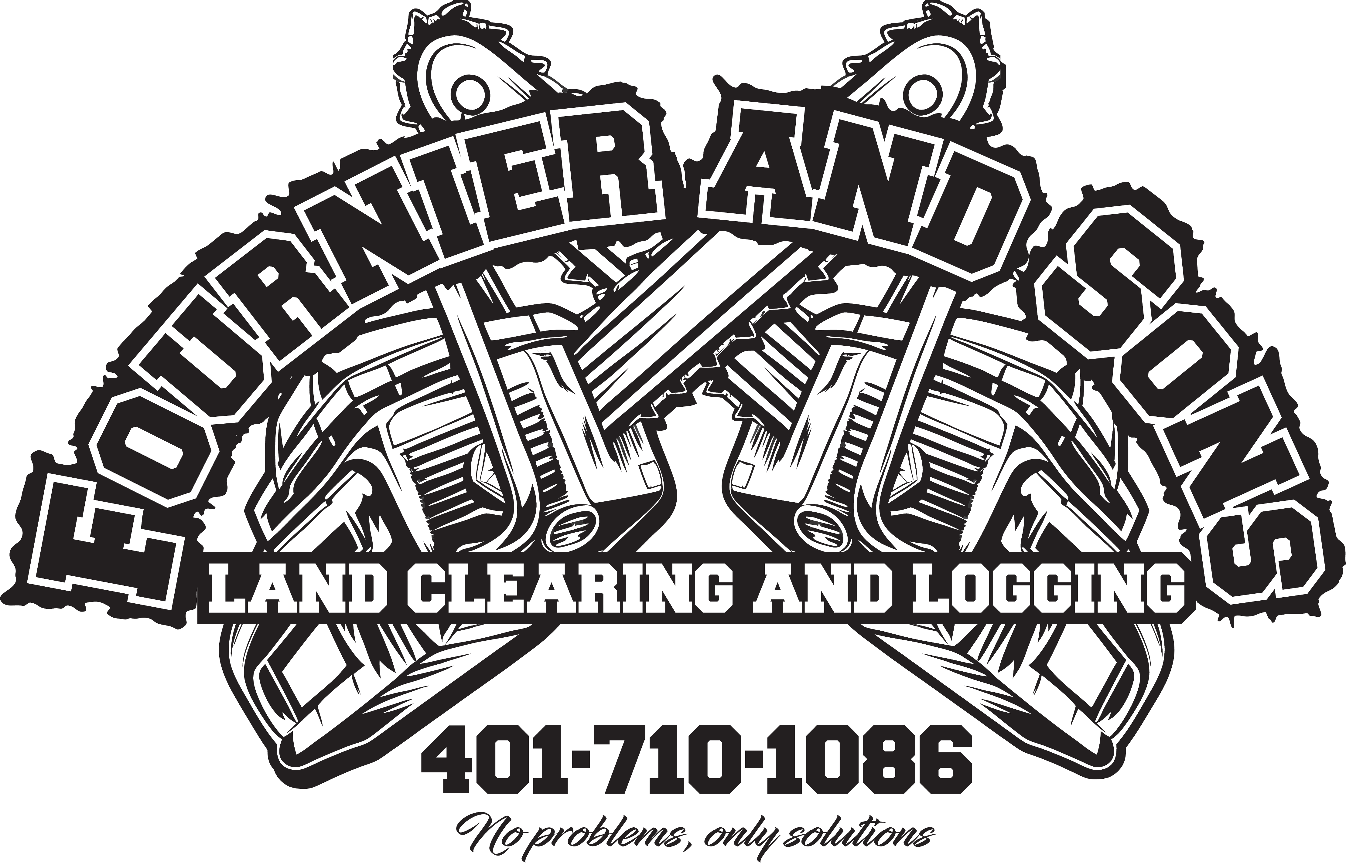
Logo Usage


Maintain clear space around the logo equal to the height of the ampersand
Use approved color variants (white, black, gold)
Do not stretch, compress, or distort the logo
Do not recolor the logo outside approved variants

Color Palette
Stone 950
#0C0A09
Primary Background
Amber 500
#F59E0B
Primary Accent
Stone 50
#FAFAF9
Headings / Bright Text
Stone 300
#D6D3D1
Body Text
Typography
Weights
400 Regular — body text
700 Bold — emphasis
900 Black — headings
Usage Notes
Minimum Size
120px wide for digital, 1″ wide for print. Below this the detail is lost.
Aspect Ratio
Always maintain the original aspect ratio. Never stretch or compress the logo.
Preferred Background
Dark backgrounds (Stone 950) are preferred. Use the white logo variant on dark, black on light.
Clear Space
Maintain clear space around the logo equal to at least the height of the ampersand character.
No Rotation
Do not rotate, skew, or apply perspective transforms to the logo.
File Formats
Use SVG or PDF for print. Use PNG for digital where vector is not supported.